RD Homes / Brand Identity Development
CLIENT: RD Homes ROLE: Creative Director AGENCY: Yurika Creative
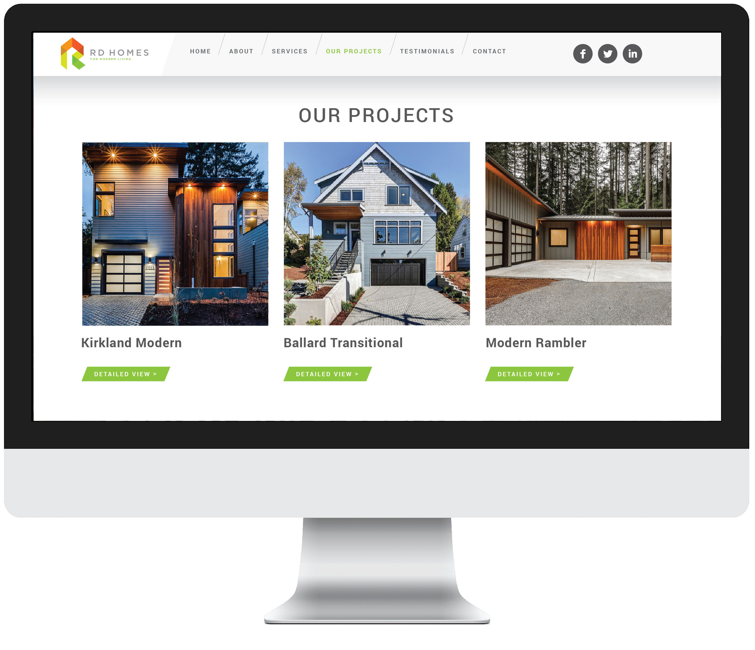
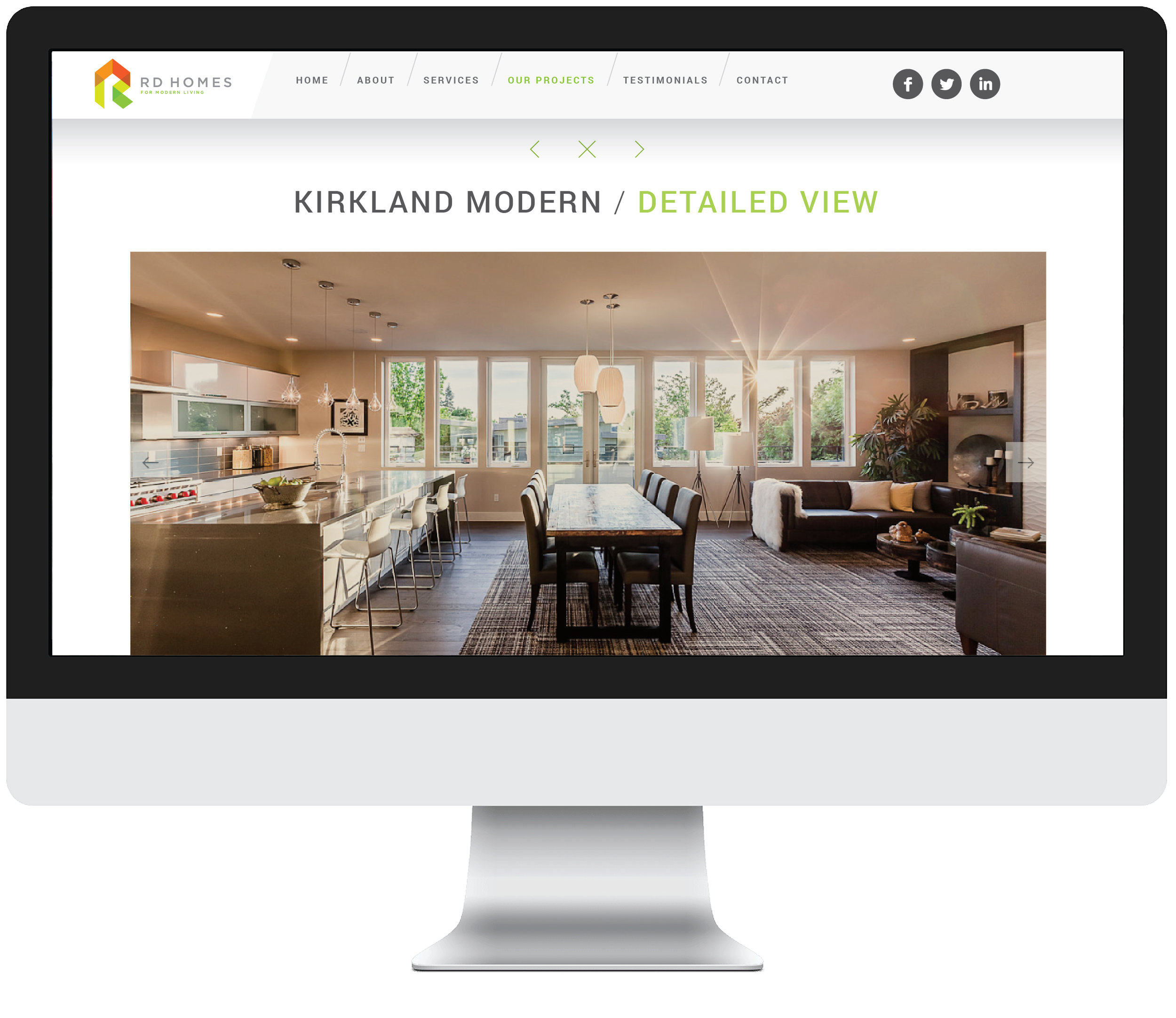
RD HOMES, a premier Pacific NW builder, approached YURIKA Creative to help them reposition and rebrand their business. The client recognized the fact that the old identity no longer served as an relevant and memorable signifier of their high end construction services.
They needed a refreshing new logo and look and feel to confidently stand apart from other builders in the greater Seattle area. After a deep dive into the construction competitive arena, I've came to realization that there was a need for a bold and iconic symbol. This symbol needed to serve as an inspiration to his future clients, while projecting their team's confidence and the unparalleled know-how. The logo's shape suggests the capital letter "R" as well as the building of one's dream home, while its vibrant colors help create a positive and optimistic feeling.
/ APPLICATIONS /
Also, I've designed a system of special business cards. The office information is laser-etched into three types of wood: birch, bamboo and walnut. And each individual crew member's info is printed on a self adhesive sticker that wraps around the card. This method not only adds an extra layer of tactility, but it also makes the cards easily customizable.


